Sunday, November 8, 2015

Tropical Cyclone ACE Climatology

Most of you know me as the Alaska climate guy. That is certainly where my current area of specialization is. However, that has not always been the case. In fact, my Ph.D. dissertation and first publication involve tropical cyclone climatology (Brettschneider, 2008). So for the time being, I will rewind the clock and do some tropical cyclone climatology.

During the last several months, I noticed a lot of discussion about cumulative tropical cyclone activity on a global scale. Record numbers of storms have formed in several tropical basins around the globe in 2015. That's the end of the story, right? Well, there are a number of ways to parse this data. The easiest way to measure tropical cyclone activity is do a simple count. You may then want to measure storms above a certain intensity. A more recent metric (~15 years) is something called Accumulated Cyclone Energy – or ACE for short. The principle behind ACE is to measure the cumulative energy generated by a storm. Since energy is a squared function of the wind speed, ACE accumulates rapidly as a storm intensifies. The formula for ACE at a single moment in time is the wind speed in knots raised to the second power, then divided by 10,000.
If you add all the ACE values during the life history of a storm, a total ACE for that storm is generated. HERE is a running total of ACE, by storm, for the 2015 season from the Weather Underground. 

Climatology

Running totals of ACE by season or by basin is very informative, as tropical cyclones are an important mechanism for transporting heat from low latitudes to high latitudes. The more cumulative tropical cyclone activity there is, the more heat transport occurs. It also goes without saying that storm intensity greatly affect the loss of life and property when storms make landfall.

In addition to seasonal charts of ACE, I am interested in the spatial distribution of tropical cyclone activity – specifically, the spatial climatology of ACE. My initial background research into ACE climatology came up empty. No research initiative appeared to address this question directly and no information on ACE climatology exists at any of the national tropical forecast centers. Therefore, I decided to generate ACE climatology maps myself. 

Previous Research

After spending a fair amount of effort generating a map set myself, it turns out that such a map does indeed exist. Doh! Oh well. Here is a link to the existing map by (Woodruff et. al, 2013): http://www.nature.com/nature/journal/v504/n7478/fig_tab/nature12855_F1.html . It covers the 1981 to 2010 time period and is in the most prestigious science journal in the world, Nature. I am only providing the link to the map as to not get in trouble for embedding the image directly. 

Interestingly, it is merely an aside in an article about coastal flooding potential from tropical cyclones. No discussion is present regarding their methodology and no citations are provided indicating earlier work on the topic. Based on the appearance of the map, it appears that they set up a 2° x 2° grid across the globe and overlaid historical storm tracks over those grid cells. Storms intersecting those grid cells were likely queried for maximum wind speed and an ACE value computed. If this was their methodology, and it probably was, variability of ACE as a function of storm speed would result in a spatial ACE under count. Also, the use of strictly defined bins causes boundary issues depending on the trajectory of storms and the size of the bins. These are not criticisms of the Woodruff et. al study, as developing an ACE climatology was not the focus of their research.

My Study

Imagine you are stranded on a small island in the middle of the Atlantic Ocean (e.g., Dominica). In any given year, how much tropical energy do you expect to encounter? That is what I set out to answer. Consider it a hazardousness-of-place study.

Using the 2° bins from the Woodruff et. al study, any storm entering the 2° space that you reside in will go into a calculation that ultimately leads to a climatological average. Well, what if the 2° bin boundary is 15 miles north of your location and a category 3 hurricane passes 25 miles north of you? The methodology described above would show zero ACE experienced at your location. In reality, much destruction probably occurred and you very well may be clinging to a tree. Therefore, I set out to map ACE by location using a regularly spaced grid of points and employing a search radius from storm positions that allows for overlapping selections. 

Figure 1 shows a map with grid points in all six tropical cyclone basins that I generated to develop an ACE climatology. The points are spaced 60 nautical miles apart. A total of 14,498 points were established. Points begin at 5°N/S and extend to 45°N and 40°S. I should note that the point spacing does account for the converging of meridians with increasing latitude. The horizontal distance between points is the same at 40° as it is at 5°.

Figure 1. Global grid of sample points from determining ACE climatology.

Methodology

Using a system of trial and error, I settled on a critical search radius of 150 statute miles for analysis from each grid point. A quick way to describe the process is that for each of the 14,498 grid points, I queried the entire IBTrACS tropical climatology database using years with storm information considered highly reliable (for quality and completion). Each time a storm position was within 150 miles of a grid point, the ACE value for that storm observation was assigned to that point. This means every storm position is within the 150-mile domain of at least 4 grid points. The working assumption is that a storm's energy affects an area of at least 150 miles in all directions of a point. Of course tropical cyclone energy decays at a fairly well established rate and that is not accounted for in this study; primarily because individual storm wind field asymmetries and motion vectors are difficult to account for.


Figure 2. Storm tracks, ACE calculation example, and seasonal ACE for the Gulf of Mexico portion of the North Atlantic Basin.

Sample Calculation

The map in Figure 2 shows how the calculations were performed using data from the 2008 North Atlantic hurricane season. Two sample points are shown with green triangles and 150-mile buffers are shown around each of the two points.

Within the buffer surrounding the point located at 13.0°N and 86.7°W (central Gulf of Mexico), a total of eight tropical cyclone positions from the 2008 season were captured. Six of those positions are from Hurricane Ike and two of the positions are from Hurricane Gustav. The six points from Hurricane Ike have a combined ACE value of 4.24. The two points from Hurricane Gustav have a combined ACE of 1.90. The total ACE for all storm positions within 150 miles of 13.0°N/86.7°W is 6.14. Even though Gustav was stronger than Ike, its faster forward motion means that fewer storm positions fell within the buffer. This nicely demonstrates that speed impacts the ACE at a location. Slower storms generate more ACE.

The 150-mile buffer surrounding the point located at 28.0°N and 82.0°W had a very different set of storm conditions. Only one storm, Tropical Storm Fay, came within 150 miles of the point. There were 14 storm positions within this buffer with a combined ACE value of 3.535. I should note that this point is over land and probably experienced a lot less ACE than a similarly situated point over water; however, the point was selected only to demonstrate the calculation process.

The eight storm positions in the central Gulf of Mexico had average ACE values of 0.7676. The fourteen storm positions over central Florida had an average ACE value of 0.2525. The speed/duration of a storm is clearly an important piece of information when interpreting the map(s).

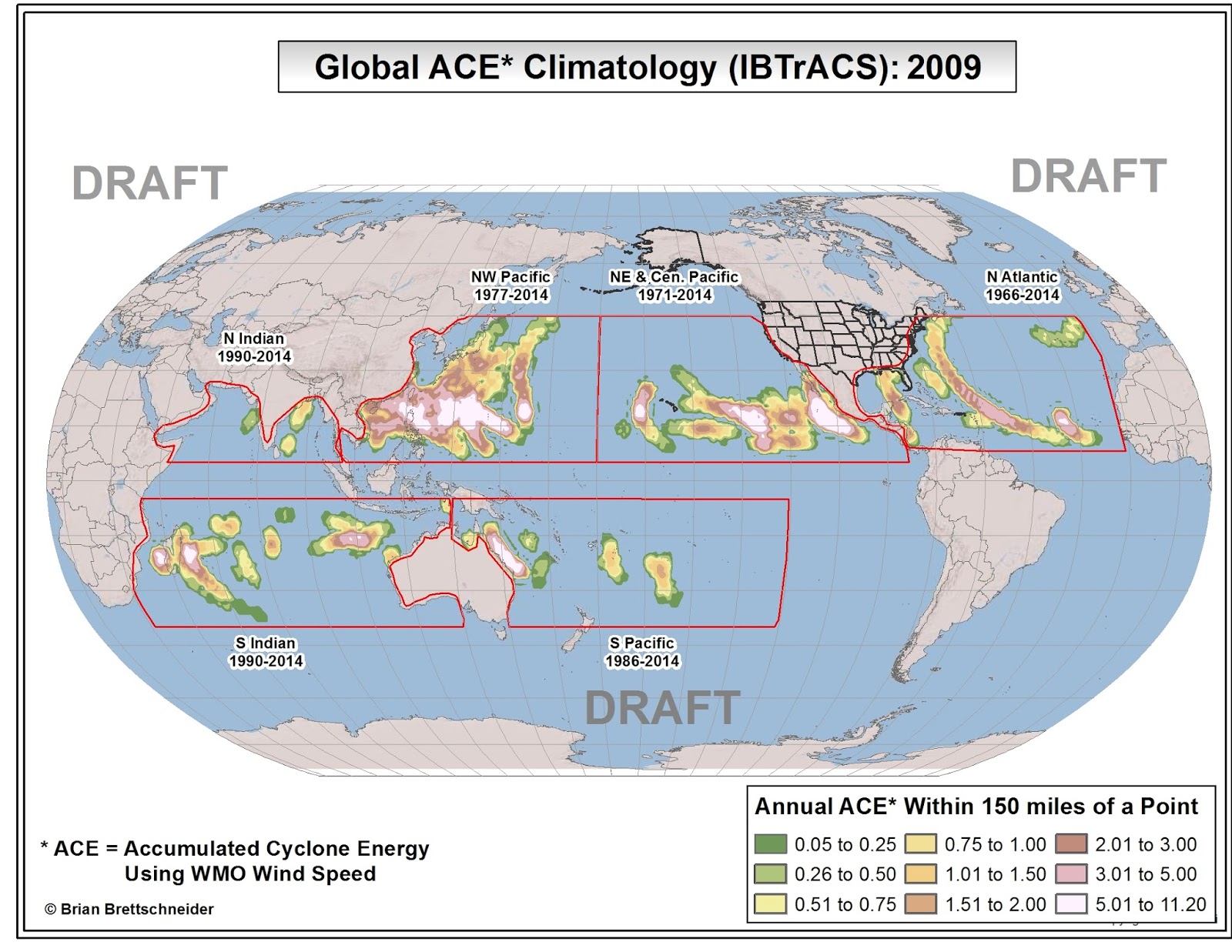
Finally, the map shows color shadings for the sum of seasonal ACE at all of the grid point locations. Areas in brown, purple, and white have the highest values while areas in green have the lowest. This is a good time to point out that the sum of ACE for all point is much higher than the seasonal total of adding up the ACE for each storm position since every storm position is captured by at least four grid points. Remember that this is an ACE climatology for 14,498 separate locations – not an ACE climatology per tropical basin.

Results

In consultation with Dr. Phil Klotzbach at Colorado State University, the following years were chosen for analysis in the separate basins:

Northeast and Central Pacific: 1971-present
Northwest Pacific: 1966-present (1977-present due to data constraints)
North Indian Ocean: 1990-present
South Indian Ocean: 1990-present
South Pacific Ocean: 1971-present (1986-present due to data constraints)

After conducting point-by-point analyses for all grid points in all basins, I came up with the map shown in Figure 3.

Figure 3. Average annual ACE for all tropical basins based on the reliable period of record.

As you can see, there is quite a bit of information in the map. The climatology of ACE reflects not only the frequency and speed of storms, but the geographical variability in storm tracks. Also, since tropical cyclones generate their energy from the latent heat stored in oceanic water, ACE is also geographically constrained to regions with relatively warm water (>26.5°C) – at least during the formative stages of their existence.

For example, storms in the Northeast Pacific Basin are geographically clustered to a fairly confined space off the southwest coast of Mexico. Storms in this region are common, achieve high wind speeds, and generally follow the same track. On the other hand, North Atlantic storms are spread out over a much larger area and there are multiple favored storm tracks depending on the season. Northwest Pacific storms are both geographically spread out and quite numerous; therefore; a large area experiences high ACE. In the southern hemisphere, the latitudinal variation in storms is fairly narrow so even with fewer storms, they traverse a similar path; thereby generating high climatological ACE values. A YouTube visualization of year-to-year ACE nicely demonstrates the seasonal variability and also some familiar patterns.

Figure 4. YouTube visualization of ACE during each year between 1966 and 2014.

El Niño (MEI)

Variations in seasonal tropical activity have previously been demonstrated to show a high degree of correlation to the presence of an El Niño or a La Niña (Gray, 1984). Shifting pressure and temperature regimes affect water temperatures, wind shear, and a host of other variable that influence the formation and development of tropical systems. During the (near) record 2015 tropical cyclone season in the Northern Hemisphere, activity in the North Atlantic basin was significantly below normal. Other basins responded with hyperactive tropical activity. The MEI in 2015 is at near record levels for the post-1950 era.

Dr. Klotzbach kindly provided two-month values of the Multivariate ENSO Index (MEI) since 1950. The MEI is an El Niño-ish index that describes "the first principal component of six observed fields" (Wolter and Timlin, 1993). Those field are: SLP, zonal and meridional surface wind components, SST, near-surface air temperatures, and total cloudiness.

Each of the years with low, neutral, and high MEI values were processed and grouped together to generate composite maps. An MEI value of +/- 0.75 was used as the threshold for low, neutral, or high. In addition, the MEI was assessed for the main development time for each hemisphere. Therefore, a neutral year in the northern hemisphere may be low, neutral, or high in the southern hemisphere since different months are evaluated for each hemisphere. Figures 5, 6, and 7 show the results of the MEI groupings. Figure 8 shows the difference between the high MEI seasons and the low MEI seasons.

Figure 5. Global ACE climatology for years with neutral MEI values (-0.75<MEI<+0.75).

Figure 6. Global ACE climatology for years with high MEI values (MEI>+0.75).


Figure 7. Global ACE climatology for years with low MEI values (MEI<-0.75).

Figure 8. Difference in ACE between years with high MEI values and low MEI values within 150 miles of a point (MEI High - MEI Low).

There is quite a bit of variability during seasons in different basing according to the MEI index. Low MEI years are more active in the North Atlantic but less active in the North Pacific Basins. The opposite is true in high MEI years. There are also latitudinal shifts. High MEI years tend to have more southerly activity in both hemispheres. There are also many sub-basin differences as well. Too many to mention. I will add to the MEI variability discussion as time permits.

Conclusion

ACE is a tremendously valuable metric for describing tropical cyclone activity. It combines frequency, intensity, and longevity into a single measure. However, there are important spatial components to ACE that are worth examining in closer detail. This (pre-)study is my attempt to further that discussion.

References

Brettschneider, B. 2008: Climatological Hurricane Landfall Probability for the United States. J. Appl. Meteor. Climatol., 47, 704–716. doi: http://dx.doi.org/10.1175/2007JAMC1711.1

Gray, W. M., 1984. Atlantic seasonal hurricane frequency. Part I: El Niño and 30 mb quasi-biennial oscillation influences. Mon. Weath. Rev., 112, 1649-1668.

Knapp, K. R., M. C. Kruk, D. H. Levinson, H. J. Diamond, and C. J.
Neumann (2010), The International Best Track Archive for Climate
Stewardship (IBTrACS): Unifying tropical cyclone best track data,
Bull. Am. Meteorol. Soc., 91, 363–376, doi:10.1175/2009BAMS2755.1

Wolter K, Timlin MS. 1993. Monitoring ENSO in COADS with a seasonally adjusted principal component index. Proceedings of the 17th Climate Diagnostics Workshop, Norman, OK,NOAA/NMC/CAC, NSSL, Oklahoma Climate Survey, CIMMS and the School of Meteorology, University of Oklahoma: Norman, OK;52–57.

Woodruff, J. D., J. L. Irish, and S. J. Camargo. (2013), Coastal flooding by tropical cyclones and sea-level rise. Nature 504, 44–52 doi:10.1038/nature12855

Additional Maps

The following forty-nine (49) maps show the ACE for each calendar year. You can click on each image to see an enlarged version of the map.




Monday, October 19, 2015

70°F Road Trip

** Update on Oct 28. 80°F Road Trip Added at End of Post **

What constitutes "nice" weather? That is a question that I have spent a lot of time thinking about over the years. Unfortunately there is no satisfactory answer. One person's nice day is reason enough for someone else to complain. We hear on the television newscast that the weather will be pleasant, or nice, or unsettled, or some other descriptive term that conforms to the expectation of what is most desirable.

Without conducting a survey, I am left to arbitrarily decide what constitutes a pleasant day. Based on my own life experiences, I will subjectively say that 70°F is an ideal temperature for a plurality of individuals. I know, I know, there will be a lot of complaints about this. Earlier this year I wrote blog posts about Picture Perfect Weather Days and Dreary Weather. Please feel free to check out those posts for more thoughts on what constitute ideal, or crappy, weather.

Road Trip(s)

Imagine that you really like days where the high temperature is 70°F and you wanted to plan a road trip where the temperature always hovers around 70°F. Well, I have done the planning for you. Since you cannot know what the temperature will be more than a week in advance (the current limit of decent forecasts), you have to go with Plan B; that is, look in a climate almanac. The go-to climate almanac for United States data is published by the National Center for Environmental Information (NCEI). The daily normal high temperature is computed for over 8,000 stations all across the United States. In addition, Environment Canada publishes monthly normals for stations across the great north. (Note: "normal" is a technical term that refers to a smoothed average for a 30-year period. It is close to an arithmetic average but not exactly the same.)

North America

What if have a passport and decided to expand our travels to include Canada and Alaska (no passport required). The portion of the trip that begins in deep south Texas on January 1 all the way through the first part of June remains the same as before.


Figure 1. Proposed route across North America where the normal high temperature is always at, or very near 70°F.
  • On January 1, the normal high temperature in deep south Texas is 70°F. This is a good place to start the trip.
  • By February 1, our road trip has only progresses as far as Laredo, Texas. The next two months will be spent on Interstate 35.
  • On March 1, the slow trek is only pulling up to the south part of San Antonio, Texas.
  • Throughout the month of March, the higher sun angle warms things up and the trip has taken us to the Texas/Oklahoma border by April 1st.
  • Now that April is upon us, we start heading east and northeast until we near the nation's Capitol by the end of the month.
  • During May, we go through Pittsburgh and Chicago and end the month in extreme northern Wisconsin on June 1st.
  • A tour of the northern states is in order to during June. In fact, we go more miles in June than any other month. Starting around the second week of June, our route makes a right turn on to the Alcan Highway. We travel through Calgary and go past Whitehorse on our way to and through Alaska's two largest cities. The month ends near Whitehorse (again) heading southeast. 
  • In July, we turn on Highway 37 and head south toward Bellingham, Washington, and finish the month in Portland, Oregon. 
  • The August portion of the trip is a scenic section along Highway 101 through Oregon.
  • In September, we loop back onto Interstate 5 before turning due east in Eugene, Oregon. We continue through to the Snake River Plain in Idaho before turning south through South Dakota and into Nebraska.
  • In October, the trip makes its way to near Kansas City, Kansas, Tulsa, Oklahoma, and ends at the Texas/New Mexico state line.
  • The November portion of the trip follows Interstate 10 from Las Cruces, New Mexico, to Arizona, where it then heads north along Interstate 40, before departing for Las Vegas, Nevada, and ending near Los Angeles, California.
  • December is another leisurely month that only takes us from Los Angeles to San Diego, California.
This version of the route traveled through parts of 31 states and 3 Canadian provinces. All-in-all we put over 13,000 miles on our vehicle.


Figure 2. Total mileage and average miles per day for route shown in Figure 1.

Contiguous U.S.

The Contiguous U.S. version of the road trip is identical to the North American version up through the second week of June. Instead of heading into Canada, it hugs the Canadian border. Then ...
  • Near Glacier National Park, the route turns south along Highway 93 and passes Yellowstone National Park and Grand Teton National Park. The route then turns southeast and travels through central Wyoming before settling near Denver, Colorado.
  • The next two months are spent leisurely traversing the Colorado high country ending up near Durango, Colorado.
  • Once we make it to September, our trip takes us back through Yellowstone National Park and southern Montana, before turning south through South Dakota and into Nebraska.
  • The period of October through the end of the year are then identical to the North America route shown in Figure 1.
This version of the route traveled through parts of 30 states. All-in-all we put over 9,000 miles on our vehicle.

Figure 3. Proposed route across Contiguous U.S. where the normal high temperature is always at, or very near 70°F.

Daily Visualization

If you are really interested in 70°F temperatures, here is a YouTube video that I put together showing the stations with a high temperature within 1°F of 70°F for every day of the year.

Figure 4. YouTube video showing the progression of 70°F days throughout the year.

Addendum: 80°F Road Trip Map

Figure 5. Proposed route across Contiguous U.S. where the normal high temperature is always at, or very near 80°F.


Figure 6. YouTube video showing the progression of 80°F days throughout the year.


Saturday, October 3, 2015

The Most Anomalous Cold Spell in Recent History

Was the October 2000 cold snap in South Texas the most extreme temperature event in U.S. climate history when looking at high temperatures? Perhaps. Let's take a look. But first, some background.

NCDC Normals

There are certain times during the year, usually winter, where large temperature swings are not uncommon. In fact, portions of the Great Plains can expect 24-hour temperature changes of 50°F at least once per year. The variability in daily temperatures is measured statistically by calculating the standard deviation for a 30-year period and smoothing it over a 15-day moving filter. For the 1981-2010 time period, the National Climate Data Center (NCDC) has published daily normal temperatures and daily standard deviations for over 6,000 stations nationwide. These values are used to assess how anomalous daily temperature reading are in comparison to the current time period. Unfortunately, this data does not extend back to earlier 30-year normal periods. The NCDC changed their computational methodology for the 1981-2010 climate normal period and reconstructing previous epochs is nearly impossible.

Comparing a reading from January 1, 1950 (for example), to the 1981-2010 climate normal period is not entirely appropriate. The 30-year baseline was developed by the World Meteorological Organization to account for slow changes in the climate of a location. In the case of the 1981-2010 climate normals, they are the comparison standard for data collected between 2011 and 2020. That being said, we can still look at the January 1, 1950, data and state how far above or below it was in comparison to the 1981-2010 normal with the understanding that it may be somewhat of an apples to oranges comparison.

September/October 2000

Early September produced all-time record high temperatures (since broken) for areas between Central Texas and Mississippi. This blog's author spent an entire week outside in Northeast Louisiana in 106°F+ temperatures conducting fieldwork during the record streak and can attest to the severity of the heat. By mid-September the temperatures had returned to seasonal normals and some record lows were even set in the Deep South. However, this was just a taste of things to come.

As early as October 1st, forecasters were calling for a major buckle in the jest stream to drive cold air down through the center of the U.S. Figure 1 shows a 48-hour forecast map issued on October 1, 2000, The leading edge of the cold front is forecasted to drive through North Dakota and Minnesota at that time. The text portion of the forecast calls, underlined in the figure, calls for the cold air to make it all the way to the Deep South.


Figure 1. NCEP 48-hour forecast discussion issued on October 1st, 2000. Source: http://archive.atmos.colostate.edu/data/misc/QHUQ00/0010/00100118QHUQ00.png 


By October 5th, the Arctic cold had already swept from Montana through the Front Range and began to enter the Texas Panhandle. Temperatures were 10°F-15°F below normal north of Lubbock. On the 6th, the front pushed through Central Texas and on the 7th it made it down to deep South Texas (see Figure 2). Not only were temperatures substantially below normal, but they were historically below normal.


Figure 2. Surface weather map from October 7, 2000.

The chart depicted in Figure 3 shows the hourly temperature observations at Houston's Bush Intercontinental Airport between October 6th and October 11th, 2000. The cold front arrived at the airport during the evening of October 6th and temperatures dropped all day through October 7th. There was a 37-hour period where the temperature did not exceed 50°F.


Figure 3. Hourly temperatures at George Bush Intercontinental Airport from October 6-11, 2000. The average hourly temperature is shown as a dashed line. Note: year 2000 hourly observations were not included in the average hourly calculations.

Nationwide Analysis

When querying the Global Historical Climate Network (GHCN) database for high temperature anomalies as compared to current (1981-2010) normals, a single event stands out. Figure 4 shows the sixteen greatest daily high temperature departures from current normals in the GHCN database at 1st-Order stations. Cooperative stations were excluded from the analysis due to time of day observations issues.


Figure 4. Greatest high temperature departures from 1981-2010 climate normals for all airport stations in the GHCN v.3 database. All entries have passed an initial quality control check. Hourly observations from Lihue in October 1965 appear to validate their cool October day in 1965.

Twelve of the fifteen most anomalous events were recorded in South Texas between October 8 and October 10, 2000. The Port Isabel high temperature of 51°F on 10/9/2000 is one of only two days in the GHCN database that if the observation were to occur today would be more than eight standard deviations below normal. If you are not familiar with what a standard deviation is, here is a brief description. If temperature data are normally distributed, which they generally are, we expect 68% of daily observation to fall within 1 standard deviation of the daily normal; 95% to fall within 2 standard deviations of the daily normal; and 99.7% to fall within 3 standard deviations of the daily normal. Considering that approximately 18 million daily climate records exist in the GHCN database, and only two are more than 8 standard deviations from the daily normal, this was truly a historic event. 

The next two maps show the maximum high temperature departure from the 1981-2010 normal (Figure 5) and the maximum standard deviation from the 1981-2010 normal (Figure 6).
Figure 5. Largest daily temperature departure from normal for entire U.S. between October 8-10, 2000.
Figure 6. Largest daily standard deviation departure from normal for entire U.S. between October 8-10, 2000.

Texas Maps

While large portions of the U.S. were significantly below normal, the core of anomalously low temperatures was south of Interstate 10 in Texas. The following three figures show just how unusual the high temperatures were in Texas. Each figure is color shaded and primary stations are marked and labelled. The first figure (Figure 7) shows the coldest high temperature during the three-day period. The next figure (Figure 8) shows the greatest high temperature departure from normal during those same three days and finally, Figure 9 shows the number of standard deviation below normal for the coldest day during that period.

Figure 7. Lowest high temperature for Texas and vicinity between October 8-10, 2000.

Figure 8. Largest daily temperature departure from normal for Texas and vicinity between October 8-10, 2000.

Figure 9. Largest daily standard deviation departure from normal for Texas and vicinity between October 8-10, 2000.

Why so Cold?

So why was it so anomalously cold in Texas? There are several answers. First, the airmass was especially cold. Figure 10 shows the upper air conditions from the Corpus Christi, TX, RAOB sounding on 10/9/00 0Z. The temperature at 850 mb is only 3.7°C. This is, by far, the lowest for so early in the season.

Figure 10. Upper air sounding for Corpus Christi, TX, at 0Z on October 9, 2000.

Just as importantly, clouds and light rain were present. If the skies were clear and the 850 mb temp were low, that would drive record low minimum temperatures. However, this post is about record low maximum temperature. An overrunning situation took shape with moist air lifting over the shallow cold airmass (isentropic upglide). The cloud cover (see Figure 11) prevented solar energy from warming the surface, and the precipitation falling through cold airmass acted to suppress temperatures due to latent heat processes.


Figure 11. GOES-8 infrared satellite image on October 8, 2000.

Conclusion

If you live in Montana, a temperature of 35°F below normal is nothing to write home about. But that same discrepancy in Texas, in October, is one for the record books. If you live in South Texas, go outside on October 8-10 of this year and imagine what temperatures in the 40s feel like.

Monday, September 28, 2015

Feels-Like Temperature Range 2014-2015.

Earlier in the summer I posted maps showing the "typical" range of temperatures during a climatological period. This post is a little different as it uses the "feels like" temperatures during the last year to depict the actual range of apparent temperatures. I use the conventional measures of Heat Index for warm temperatures and Wind Chill for cold temperatures. Only those stations that had sufficient observations to measure both a summer Heat Index and a winter Wind Chill were utilized. That required valid temperature, dewpoint (for Heat Index) and wind (for Wind Chill) measurements.

Heat Index:

The first map (Figure 1) shows the highest Heat Index recorded at ASOS station during the summer of 2015. The Heat Index was computed from hourly ASOS observations using the temperature and dew point (Steadman formula). The maximum dew point for 2015 is shown in Figure 2.

Figure 1. Highest Heat Index recorded in 2015 at ASOS stations.

Figure 2. Highest dew point temperature recorded in 2015 at ASOS stations.

Wind Chill:

Wind Chill is the apparent temperature based on the combined effect of temperature and wind. As many readers know, the wind chill formula was updated in 2001 (Osczevski 2001). In this analysis, I looked as hourly ASOS observations and computed wind chills for every hour during the 2014-2015 winter (November through March). The results are shown in Figure 3.
 Figure 3. Lowest Wind Chill recorded in the 2014-2015 winter at ASOS stations.

Range:

Unsurprisingly, continental climates experience the greatest range of annual temperatures (see interior Alaska and the northern Great Plains. While interior Alaska has the greatest annual temperature range in the U.S. based on climatology, several stations in North Dakota won the feels-like temperature lottery. In Alaska, the coldest temperatures are usually accompanied by calm winds and the warmest summer temperatures usually are so dry that the apparent temperature is 5°F-10°F lower than the actual temperature.

The other surprising aspect to the map is the range in Iowa is greater than the range in neighboring Nebraska.
Figure 4. Difference between highest Heat Index and Lowest Wind Chill at ASOS stations during the last year (summer minus winter).

Figure 5. ASOS stations used in the analysis depicted in Figures 1-4.