Friday, July 31, 2015

Anchorage for the Winter Olympics

The International Olympic Committee just awarded the 2022 Winter Olympics to Beijing/Zhangjiakou (China). The city of Zhangjiakou is located several hours northwest of Beijing and has a emerging skiing infrastructure that caters to the Chinese elite in Beijing. Of course Beijing was the site of the 2008 Summer Olympics and this recent experience will undoubtedly help with preparation for the 2022 games.


Figure 1. Photograph of 2022 site venue in Zhangjiakou. Image source: http://www.businessinsider.com/beijing-olympic-mountain-venue-has-barely-any-snow-2015-7

As an Alaskan, I cannot help but wonder what it would be like to have the Winter Olympics take place right here in out corner of the world. Anchorage very nearly won the rights for the 1994 Winter Olympics that ultimately ended up in Lillehammer, Norway. We placed a very close second place in the first round of voting but did not pick up any votes in the second round and ended with zero votes in the third and final round of voting.

Well, now that 2022 has been awarded, what about 2026? It turns out that some people have already been thinking about this. Former Anchorage mayor Dan Sullivan convened an Anchorage 2026 exploratory committee to discuss the possibility. According the the Municipality of Anchorage's website, the last meeting of the committee was in 2013. There are (were?) 25 people on the committee that represent a cross-section of the business and sports community. There's even a Facebook Page promoting Anchorage 2026 that has over 5,000 Likes.

Temperatures

As a climatologist, what interests me the most about the possibility of Anchorage hosting the Olympics in 2026 is the suitability of the weather for such an event. [Note: there does not appear to be a climatologist on the exploratory committee]. The last two Winter Olympics [in Vancouver and Sochi] were famously warm. High temperatures in the 50°s and 60°s made them feel more like Summer games than Winter games. So how does Anchorage stack up from a historical perspective? Let's look at the prior Olympic climatology and compare the Anchorage values for the same dates. Figure 1 shows the average temperature for each Winter Olympics since 1932 (no games were held in 1940 and 1944 due to World War II). 

Figure 2. Average daily temperature (high plus low divided by two) during the dates of the Winter Olympics for the host city (red) and Anchorage (blue). Data obtained from the Olympic reports FTP server, National Center for Environmental Information, and various national meteorological organizations.

Anchorage is consistently colder than the host city according to Figure 2. In fact, Anchorage is 10°F colder on average. The data points for 2018 and 2022 show the normal daily temperature for the host cities and the normal daily temperatures for Anchorage. Not only is Anchorage as cold or colder than the other cities on the list, Anchorage is consistently cold. There is much less variability in the winter temperatures observed in Alaska's largest city compared to other "cold" cities in Europe and Asia. 

Snow

Of course it takes more than cold to be considered for the Olympics – you need snow too. This is where Anchorage really stands out. It's not that Anchorage gets a ton of snow, it's that we always have snow and always have temperatures suitable for making snow. Even last winter, where a record low total of 25.1" of snow fell, at least 1" of snow was on the ground every day during the winter. In a more typical winter, 12"-15" of snow is on the ground in mid- to late-February.


Figure 3. Actual high temperature, low temperature, and snow depth measurements for Anchorage during the dates of the Winter Olympics.

A depth of 12" of plenty sufficient for cross-country races at the sea level trails within Kincaid Park or at the Campbell Tract. In the mountains, there is a near certainty that heavy snow will blanket any mountain(s) identified for downhill ski races. In the event that too little natural snow falls, there will be many opportunities to create snow during cold nights in advance of the games. Figure 3 shows the average snow depth during past Winter Olympics and the normal depth during the upcoming games.

The newly awarded 2022 games in Zhangjiakou are located in an area that receives very little snow. Their bid document states that nearly all the snow used in the games will be artificially made. While great advancements have been made in artificial snow production over the years, it is still not the same as natural snow. Places like Alyeska and Hatcher's Pass almost always have a solid natural snow base by mid-February. As with many things in life, natural is better.

Summary

From a climatological perspective, Anchorage is ideally suited to hosting the Winter Olympics. It is cold, but not too cold (sorry Fairbanks), and it receives plenty of snow (or has lengthy snow-making opportunities).

Other Considerations

While this narrative is primarily focused on the climate side of the equation, it is worth mentioning a few of the other benefits of an Anchorage Olympic games.

Major infrastructure projects are a mainstay of Olympic host cities. New roads, railroads, ports, utilities, etc. must be built or improved. Much of these costs are paid for with Federal dollars. If the 2026 Winter Olympics are awarded to an American city, which is a strong possibility, the money will go somewhere. It might as well come to Alaska.

Anchorage has a strong hotel, healthcare, engineering, and university system in place. Anchorage also has a workforce with substantial construction experience. Many of the services that are required of a host city are already functioning. This puts us ahead of many smaller resort towns in the western Lower 48.

Alaska has talked for decades about diversifying it's economy but has never acted on it. The Olympics are an instant way to build-out the city for a post–resource extraction economy. Let's face it, the oil will run out someday soon. Then what? A gas pipeline is still a pipe dream. Mining and fishing bring only small royalties to the state and it is hard to see where more of those jobs will come from. Why not plan on bringing high-tech jobs to Alaska. What about server farms? Or going all-in on tourism? How about becoming the center of a pan-Arctic economy? Whatever it is, the Olympics is an opportunity to let other people pay a lot of the bills for our future. 

In so many ways, Anchorage 2026 could be a window to our future. This is our last, best shot at it. Let's show the world that Anchorage is a world class winter wonderland!

P.S. - As recent Olympic and World Cup biddings have shown, paying bribes to selection committee members can make a big difference. If there were a medal awarded to states with ethically challenged politicians, Alaska might win the Gold. Maybe we can put those bribery skills to good use for a change.  :)

Friday, June 26, 2015

All-Time Heat Record Anniversary


100 year anniversaries don't come around very often. This is one of those rare exceptions. You see, 100 years ago, June 27, 1915, the weather observer at Fort Yukon wrote down a high temperature of 100°F in their monthly log (see Figure 1). That's right, a triple-digit temperature – right here in Alaska. In the 100 years since then, the record has been approached a few times but never equaled.


Figure 1. June 1915 scanned Cooperative form for Fort Yukon, Alaska.

Even though the 100°F temperature is recorded on June 27th, it most likely occurred the day before – June 26th. This observer made their readings at 2 p.m. every day and so when they inspected the min/max thermometer at 2 p.m. on the 27th, the 100°F temperature indicator was probably left there from the previous day. The typical time for a high temperature in June is around 5 p.m. Standard Time. Having a 1-day offset of temperatures is a quite common occurrence for Cooperative stations all over the U.S. That being said, it will always be shown as a June 27th observation.

Data Quality

Is this temperature reasonable? The basic answer is yes. Richard Thoman, the NWS Alaska Region Climate Science and Services Manager, did an analysis for a conference in 2009 that described the Fort Yukon reading as plausible. He noted that it was near the solstice, skies were clear, and other very warm temperatures were observed. Figure 2 shows the highest temperature observed in the last few days of June in 1915.
Figure 2. Warmest high temperature during the last six day of June in 1915.

In Fairbanks, the high temperature reached a scorching 95°F on June 26th (likely the same day that Fort Yukon reached 100°F). Remarkably, this temperature occurred at or shortly after noon. According the the Fairbanks Sunday Times, a thunderstorm with hail formed (hail noted on Cooperative observer form – not shown) and cooled off the city (see Figure 3) at noon.


Figure 3. Fairbanks Sunday Times story from June 27, 1915.

If a thunderstorm had not cooled off Fairbanks so early in the day, it is entirely possible that they would have warmed by another 5°F. Also, since the 100°F temperature at Fort Yukon is only 5°F to 8°F warmer than the nearby stations, it is possible that a lack of clouds or a just-right wind direction allowed the temperature to jump a few degrees warmer than would ordinarily be expected. It is also possible the the reading is not valid. However, there is far too little evidence to toss the reading out. Therefore, it is the accepted state record.

So, congratulations to Fort Yukon on the 100th anniversary of the warmest official temperature in Alaska history!


Monday, June 8, 2015

Daylight and Twilight

Did you know that interior Alaska actually receives more sun and twilight than any other place in the U.S. and that the northern hemisphere Arctic latitudes receive more daylight and twilight than their counterparts in the southern hemisphere?

The Northern Hemisphere:

Alaska is known for long summer days and long winter nights. However, if you average all 365 days together, everyone ends up with 12 hours of daylight and 12 hours of darkness throughout the course of the year no matter where in the world you are, right? Actually, that is not correct. 

Looking at Figure 1 below, the red line at the bottom of the chart shows that daylight at the equator averages about 12 hours and 7 minutes per day over the course of the year. Remember that the sun is a circle (not a point) and we receive daylight from the top of the sun's disc before the middle of the disk reaches the horizon. The same is true at sunset. This makes an average day over 12 hours everywhere.


Figure 1. Hours of daylight and daylight plus Civil Twilight by latitude. All data obtained from the U.S. Naval Observatory's Astronomical Observations Department.

At the equator, the sun moves nearly straight up and down with respect to the horizon. This means the sun rises quickly and sets quickly. As we move to higher latitudes, the path of the sun is more oblique; i.e., the sun moves more and more diagonally with respect to the horizon. It therefore takes longer for the entire disk of the sun to make is across the horizon at both sunrise and sunset. 

If the sun were a point and not a circle, the annual average length of a day would be 12 hours everywhere. Since the sun is a 2-dimensional circle from our perspective, the relative speed of the rising and setting dramatically changes the amount of light we receive. This effect is greatest at the Arctic and Antarctic Circles due to the effective ground speed of the sub-solar point near the time of the solstices. The difference in cumulative day lengths between the equator and the Arctic Circle (for all 365 days) is 225 hours per year – or 37 minutes per day on average. 

Figures 2 and 3 show the length of daylight (Figure 2) and the combined length of daylight and Civil Twilight on the summer solstice.

 Figure 2. Length of daylight on the summer solstice.

Figure 3. Combined length of daylight and Civil Twilight on the summer solstice.

If we include Civil Twilight, which is when the entire sun's disk is below the horizon but by no more than 6°, the extra light for Alaska dramatically increases. At 69°N latitude, the 365-day average for daylight plus Civil Twilight is 15 hours and 6 minutes. At the equator, the 365-day average is only 12 hours and 50 minutes. The average difference in light (daylight plus Civil Twilight) is a shocking 2 hours and 16 minutes per day. Places just north of the Brooks Range in Northern Alaska therefore receive the most usable light of any place in the U.S. Table 1 shows the cumulative length of daylight and Civil Twilight for cities at a variety of latitudes.


Table 1. Annual hours of daylight and Civil Twilight for nine cities sorted by latitude.

The final two maps (Figure 4 and 5) show the length of daylight plus Civil Twilight for Alaska and the Lower 48. Again, note how much more light Alaska receives than the Lower 48 over the course of the year.

Figure 4. Average annual length of daylight plus Civil Twilight. The average is for all 365 days of the year. The map perspective is Alaska-centric.

Figure 5. Average annual length of daylight plus Civil Twilight. The average is for all 365 days of the year. The map perspective is Lower 48–centric.

Hemispheres Comparison:

What about our friends in the south? Isn't the southern hemisphere a mirror of the northern hemisphere? The answer is "no." You see, the earth orbits the sun in an ellipse – not a circle. We are actually farthest from the sun on July 3rd and closest on January 4th. When we are farthest from the sun in the summer, we move more slowly (think of a figure skater spinning faster/slower as they move their arms inward/outward). Since the earth moves slower in the northern hemisphere summer, it takes longer for the sun's sub-solar point to approach it's northern most latitude (Tropic of Cancer) and to start its retreat southward.

Figure 6 shows that the earth revolves nearly 1,000 meters per second slower at the summer solstice versus the winter solstice and Figure 7 shows the rate of change of the sub-solar point over the course of the year.


Figure 6. Earth's revolution speed around the sun (fixed point of reference) throughout the course of a single (tropical) year.


Figure 7. Daily change in the position of the sub-solar point throughout the course of the year. Units are (absolute value) of degrees of change per day in latitude. Earth's revolution speed is also shown.

The difference in speed is demonstrated by several easy to describe facts. First, the time from the March Equinox to the September Equinox covers the earth's slow period. The time difference between the March and September equinoxes is 186.4 days. On the other hand, the time difference from the September equinox to the March equinox is only 178.8 days. If we look at Barrow, they have 79 days in summer with no sunset but only 61 days with no sunrise in winter (+18 differential). At the same latitude in the southern hemisphere, there are 75 days with no sunset and 66 days with no sunrise (+9 differential). Therefore, we conclude that summer is longer in the northern hemisphere.


Figure 8. Average number of hours of daylight and daylight+civil twilight by latitude for each hemisphere.

The effect of the slower earth movement in summer is longer periods with daylight and also twilight. Figure 8 shows the average number of hours of daylight and civil twilight by latitude in each hemisphere. As we increase in latitude, the angle of the sun's movement becomes more diagonal. And since the sun is a disc (from our perspective), at high latitudes it takes longer for the center of the sun's disc to cross the horizon after the top can be seen. This is true in both hemispheres. However, since the earth moves more slowly in the summer, there are more days with a high sun angle in the northern hemisphere than in the southern hemisphere. When we add all the hours up, there is about 1.6% more daylight in the northern hemisphere than the southern hemisphere. If we expand to look at daylight plus civil twilight, the hemisphere difference is more dramatic. In fact, ever place in Alaska from Fairbanks to Barrow receives more daylight plus twilight than any place in the southern hemisphere.

Conclusion:

The next time you hear someone say that all the day and night hours even out over the course of the year, remind them that reality is a little more complicated.

Tuesday, April 21, 2015

Alaska Size Comparison Maps

The fun little map I made the other day while my kids were watching a movie showing the size of Alaska compared to other states really took off. In response, I put together this new set of maps where different states are used. Some states are used in more than one map and others appear only once. The states are depicted in an Albers equal area map projection. As the name implies, an equal area projection leaves the relative sizes of the states proportionally accurate. Feel free to share these maps with your friends, but please talk with me first before placing them on printed materials.

And now, the maps ....


Friday, April 17, 2015

Alaska High Temperature Categories

** Note: this is the Alaska-centered version of this blog post. For the Contiguous U.S.-centered version, click HERE. **


"Today's high temperature will be in the 60°s." - unknown

Official, unofficial, anecdotal, and other communication mediums frequently discuss temperature forecasts in terms of 10-degree Fahrenheit temperature ranges. While greater precision in forecasts is always available, using these broad temperature categories is fairly useful.

Looking at longer time-scales, these types of temperature categories are especially useful. Me might say, for example, that Dallas, Texas, is typically in the 90°s during the month of June. This gives a meaningful description of the early-summer climate at that location without confusing it with an actual forecast. If we expand upon the brief example for Dallas, Texas, it might be useful to ask ourselves how common are days in the 90°s at Dallas and at other places across he U.S. Why stop with 90°s? What about 80°s, or 50°s, or 20°s?.

Methodology

To find the answer to this question, we need to look at high temperature data for as many stations across the U.S. as possible. The National Climate Data Center (NCDC) maintains an archive of daily climate data for thousands of stations across the U.S. as part of the Global Historical Climatology Network (GHCN) database.

For this analysis, I placed three restrictions on the data. 1) only data since 1981 were utilized, 2) stations must have 10+ complete years of data, and 3) only WBAN (first-order) stations were used.

The first criteria allows us to closely mirror the current 1981-2010 climate normal period employed by the NCDC. The second criteria just makes sure enough data to draw meaningful conclusions. The third criteria has to do with the processing power and memory limitations of my computer.

Using the aforementioned selection criteria, a total of 985 stations contained sufficient data for inclusion. A map of those stations is shown in Figure 1.

Figure 1. All WBAN stations with at least 10 years of complete high-temperature data since 1981.

10-Degree Category Maps

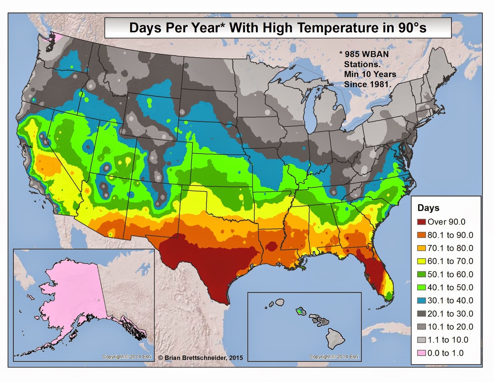
The following section contains 12 maps each representing the number of days per year with a high temperature in a 10°F range. For example, how many days have a high temperature in the 90°s? This query would include all days with a high temperature greater than or equal to 90°F and less than or equal to 99°F. The first and last maps represent categories greater than 10°F; e.g., days with a high temperature less than 0°F, and days with a high temperature greater than or equal to 100°F. Please note that no attempt was made to account for elevation in mountainous areas.

Figure 2. Number of days per year with a high temperature below 0°F.

Figure 3. Number of days per year with a high temperature in the +0°s (0°F to 9°F).

Figure 4. Number of days per year with a high temperature in the 10°s (10°F to 19°F).

Figure 5. Number of days per year with a high temperature in the 20°s (20°F to 29°F).

 Figure 6. Number of days per year with a high temperature in the 30°s (30°F to 39°F).

 Figure 7. Number of days per year with a high temperature in the 40°s (40°F to 49°F).

 Figure 8. Number of days per year with a high temperature in the 50°s (50°F to 59°F).

 Figure 9. Number of days per year with a high temperature in the 60°s (60°F to 69°F).

 Figure 10. Number of days per year with a high temperature in the 70°s (70°F to 79°F).

 Figure 11. Number of days per year with a high temperature in the 80°s (80°F to 89°F).

 Figure 12. Number of days per year with a high temperature in the 90°s (90°F to 99°F).

Figure 13. Number of days per year with a high temperature 100°F or above.

Figure 14. Most common 10° high temperature group.

Wednesday, April 15, 2015

U.S. High Temperature Categories

** Note: this is the Contiguous U.S.-centered version of this blog post. For the Alaska-centered version, click HERE. **


"Today's high temperature will be in the 60°s." - unknown

Official, unofficial, anecdotal, and other communication mediums frequently discuss temperature forecasts in terms of 10-degree Fahrenheit temperature ranges. While greater precision in forecasts is always available, using these broad temperature categories is fairly useful.

Looking at longer time-scales, these types of temperature categories are especially useful. Me might say, for example, that Dallas, Texas, is typically in the 90°s during the month of June. This gives a meaningful description of the early-summer climate at that location without confusing it with an actual forecast. If we expand upon the brief example for Dallas, Texas, it might be useful to ask ourselves how common are days in the 90°s at Dallas and at other places across he U.S. Why stop with 90°s? What about 80°s, or 50°s, or 20°s?.

Methodology

To find the answer to this question, we need to look at high temperature data for as many stations across the U.S. as possible. The National Climate Data Center (NCDC) maintains an archive of daily climate data for thousands of stations across the U.S. as part of the Global Historical Climatology Network (GHCN) database.

For this analysis, I placed three restrictions on the data. 1) only data since 1981 were utilized, 2) stations must have 10+ complete years of data, and 3) only WBAN (first-order) stations were used.

The first criteria allows us to closely mirror the current 1981-2010 climate normal period employed by the NCDC. The second criteria just makes sure enough data to draw meaningful conclusions. The third criteria has to do with the processing power and memory limitations of my computer.

Using the aforementioned selection criteria, a total of 985 stations contained sufficient data for inclusion. A map of those stations is shown in Figure 1.

Figure 1. All WBAN stations with at least 10 years of complete high-temperature data since 1981.

10-Degree Category Maps

The following section contains 12 maps each representing the number of days per year with a high temperature in a 10°F range. For example, how many days have a high temperature in the 90°s? This query would include all days with a high temperature greater than or equal to 90°F and less than or equal to 99°F. The first and last maps represent categories greater than 10°F; e.g., days with a high temperature less than 0°F, and days with a high temperature greater than or equal to 100°F. Please note that no attempt was made to account for elevation in mountainous areas.

Figure 2. Number of days per year with a high temperature below 0°F.

Figure 3. Number of days per year with a high temperature in the +0°s (0°F to 9°F).

Figure 4. Number of days per year with a high temperature in the 10°s (10°F to 19°F).

Figure 5. Number of days per year with a high temperature in the 20°s (20°F to 29°F).

 Figure 6. Number of days per year with a high temperature in the 30°s (30°F to 39°F).

 Figure 7. Number of days per year with a high temperature in the 40°s (40°F to 49°F).

 Figure 8. Number of days per year with a high temperature in the 50°s (50°F to 59°F).

 Figure 9. Number of days per year with a high temperature in the 60°s (60°F to 69°F).

 Figure 10. Number of days per year with a high temperature in the 70°s (70°F to 79°F).

 Figure 11. Number of days per year with a high temperature in the 80°s (80°F to 89°F).

 Figure 12. Number of days per year with a high temperature in the 90°s (90°F to 99°F).

Figure 13. Number of days per year with a high temperature 100°F or above.

Figure 14. Most common 10° high temperature group.