How hot does it get on the hottest day of the year? Several times in the last few years, I have presented maps and charts that look at the annual curve of normal temperatures. That's all fine and well, but it leaves out what people care about the most – namely, the actual temperatures. So let's look at them, when they occur, and how if differs for the normal curve.
The map in
Figure 1 shows the average value for the warmest day of the year as measured for the years 1981-2016. If a station had at least 15 complete seasons (no more than 5 missing days for the May through September time period) it was included in the analysis. The calculation was an arithmetic average – not a median. I won't bother describing the patters, except to note that no attempt was made to account for the drop of temperatures with altitude beyond the actual station values themselves.
Fig 1. The average temperature on the hottest day of the year between 1981 and 2016. A minimum of 15 years required for inclusion. 8,011 stations were used to make the map.
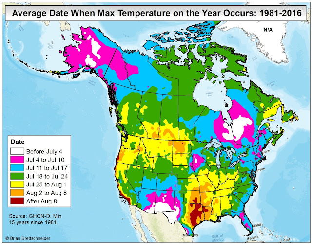
Of interest to me is when the annual hottest temperature occurs. Do they coincide with the summer solstice? Do they lag by days or weeks? Using the same set of stations that was used to determine the value for the hottest temperature, I flagged the date of occurrence (if more than one date in a season tied for the highest temperature, an average of those dates was used.). The map in Figure 2 shows the results. There's a lot of stuff going on withing the map. Notice the early dates for the peak summer maximum temperature in Alaska, southeastern Canada, and the deserts of the southwestern Lower 48! In Alaska, this reflects the time of high sun before the clouds and rainy season commences. In the southwestern Lower 48, it reflects the time of high sun before the clouds and rainy season commences. In the southwestern Lower 48, it reflects the time of high sun before the summer monsoon sets it. Not sure what is going on in southeastern Canada or the region of Iowa and Minnesota.
The relatively late date of the hottest day of the year in the western Gulf of Mexico coast is a function of the lag of warmer water temperatures advecting inland. Many of the other patterns reflect the onset of sunny/cloudy and wet/dry seasonal patterns.
Fig 2. The average date of the highest annual temperature observed between 1981 and 2016. A minimum of 15 years required for inclusion. 8,011 stations were used to make the map.
From a biological, agricultural, and energy point of view, a single date where the hottest temperature occurs is less important than the annual curve of temperatures. For that, the use of National Center for Environmental Information (NCEI) climate normal is called for. The map in Figure 3 shows the date when the average daily temperature reaches its seasonal inflection point (if more than one day, the median date was used). Once again, a distinct early season peak in temperatures is noted in Alaska and the desert southwest – owing to high sun and before a strong transition to greater cloud coverage and precipitation. Other regions reflect the thermal lag of ocean water temperatures and regional variations in seasonal cloud and rain patterns.

Fig 3. The date where the annual temperature cycle reaches its maximum value using 1981-2010 climate normals. A total of 6,076 stations were used to generate this map. For U.S. stations, it uses NCEI published values. For Canadian stations, values interpolated from GHCN v.4 data.
Of tremendous interest to me is the difference between these two maps. Figure 4 shows how many days earlier or later the average annual hottest day is compared to the normal peak summer temperature. The computation is: [average hottest temperature {minus} normal peak temperature]. Remarkable, there are some dramatic differences between the two. In Alaska, if all variables fall into place, the days near the solstice often produce the warmest temperatures several weeks before the normal temperatures peak. In Texas, the dry air from the Mexican Plateau allow for exceptional heat to move into Texas through the month of June, but is suppressed later in the summer. At the same time, a warming Gulf of Mexico slowly drives up the normal daily temperature through July (thanks to Richard Berler from KGNS in Laredo, Texas, for this analysis). South of Hudson Bay, a similar effect occurs in Ontario and Quebec. To be honest, I have no idea why.
Of equal interest, is the area shaded in red along the lower Ohio River valley. These areas typically see their highest observed temperature of the years two to three-and-a-half weeks after the seasonal temperature inflection point. This is either a result of an early peak in seasonal normal temperatures, a late occurrence for the observed highest temperature, or some combination of both. Based on the patterns in Figure 3, it appears they have an unusually early peak to their seasonal temperatures compared to surrounding areas but their observed dates for the hottest temperatures is in line with surrounding areas. Still, no other portion of the country is this disconnected with positive values.
Fig 4. Difference in days between the average date for he warmest day of the year and the normal date of peak temperatures (actual minus normal). A total of 6,506 stations had both an actual average max temperature and a normal annual match temperature.
June 24 Addition:
Some of the patterns that we see in the maps are artifacts of the time period chosen. In the above sections, only data from 1981 onward was used. If we do not restrict the time frame, patterns shift somewhat. The mosaic below shows what happens when the hottest day of the year analysis is changed. The top row in Figure 5 shows the information depicted in Figure 2 – data from 1981 onward. The bottom row uses all station data regardless of the year. A minimum of 30 years was required for inclusion.
Fig 5. Comparison between the hottest day of the year when looking at only data since 1981 (top row) and all years (bottom row). In each row, the left map shows the interpolated categories and the right map show the interpolated categories with the station data overlaid.


